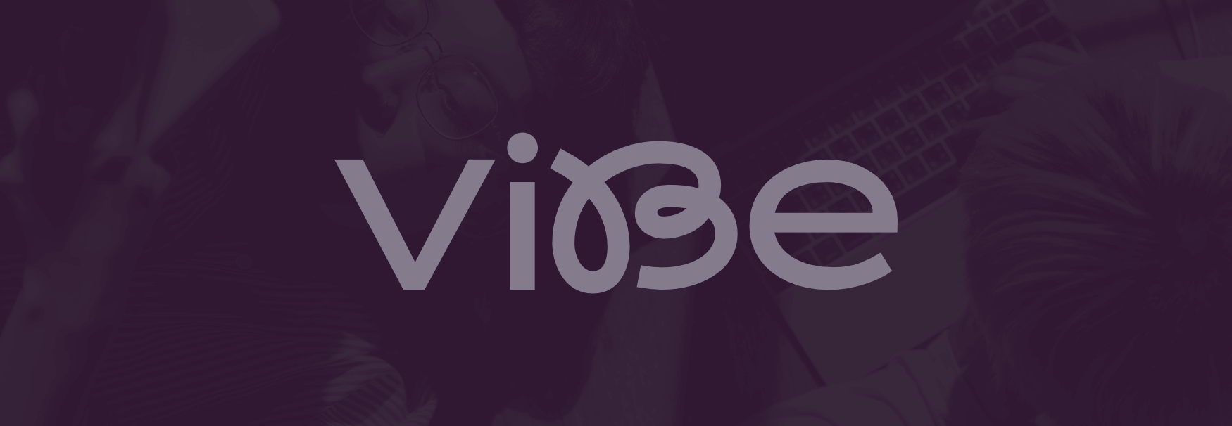
The brand’s logotype design combines two different styles of typography. The end result is clean and simple, with a bit of a playful vibe (pun intended).
Every year, people from all over the country arrive to Bogotá looking for new opportunities. But, more often than not, they find themselves lacking the means to rent an appartment or a house by themselves, as it can be quite expensive, depending on where they want to live.
In that sense, co-living presents itself not only as an alternative to find affordable housing, but also as a way for them to meet and connect with new people, which would also help them in the process of adapting to the dynamics of a big city.
As I intended to promote this concept as a new way of living, I tried to reflect that in the brand name, which comes from the spanish word “vive” (live, in english), but modified to become something different (while referencing the english slang “vibe” at the same time).

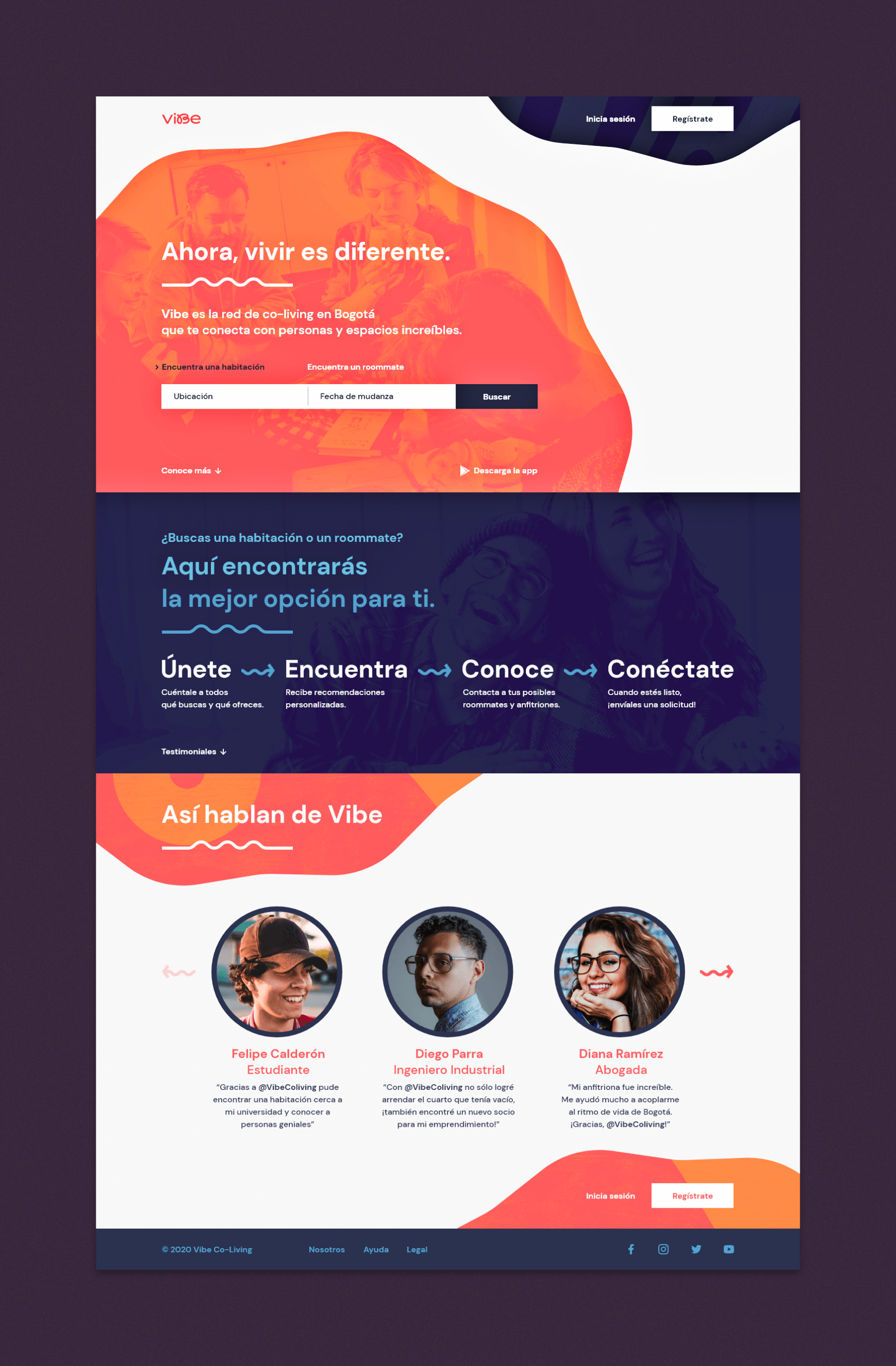
Vibe’s homepage. I used textures, bright colors and different kinds of shapes to give the project an expressive and youthful look and feel.
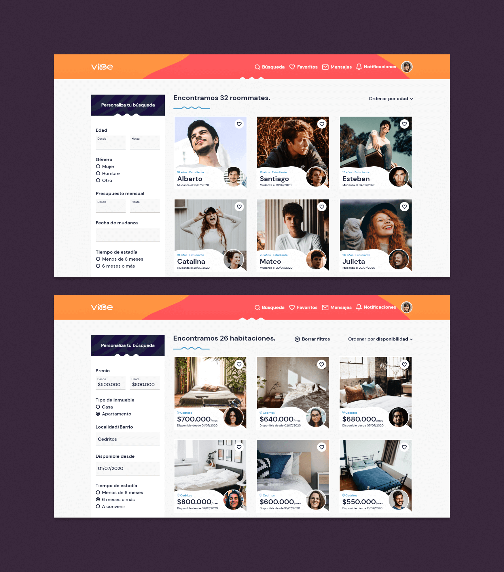
Whether they need a place to live, or have a spare room at home to rent, users can find suitable matches through a system of filters. Should they need additional information before sending a request, a contact option is available.

Search section of the site, both for roommates and hosts. Filters are presented through a sidebar.

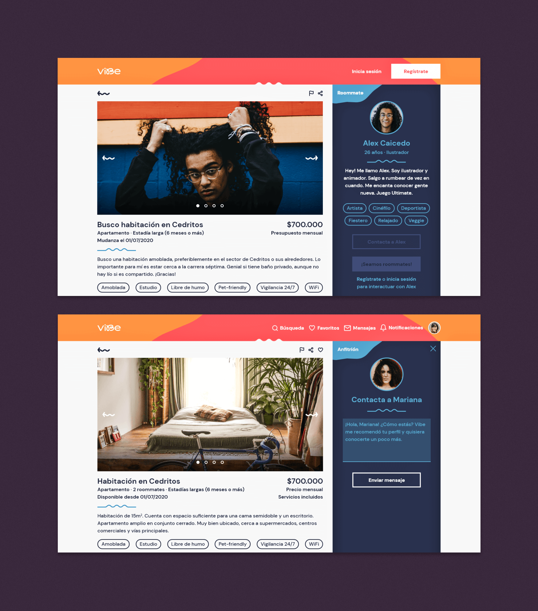
This is how ads look like in the platform. Roommates will include their budget and details of what they’re looking for, while hosts will promote their spaces and provide relevant information (monthy price, location, ammenities, etc). In both cases, the user profile of the ad owner will be visible.
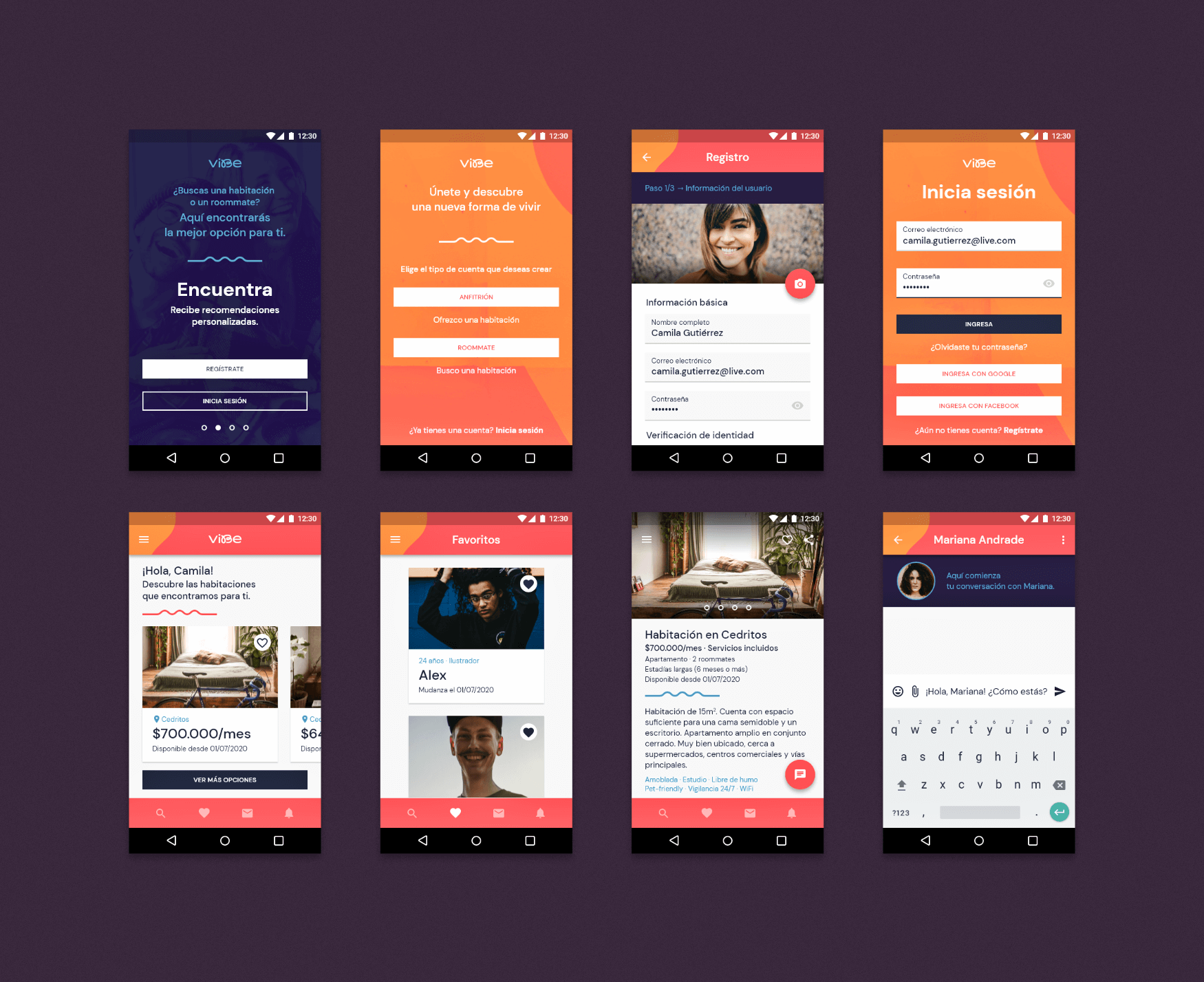
Once the desktop version of the site was completed and prototyped, I designed an Android app (as it is the most used mobile OS in Colombia), using the Material design system as a guide.

Some of the screens designed for Vibe’s Android app. While based on the Material design system, it maintains its distinctive visual style.
